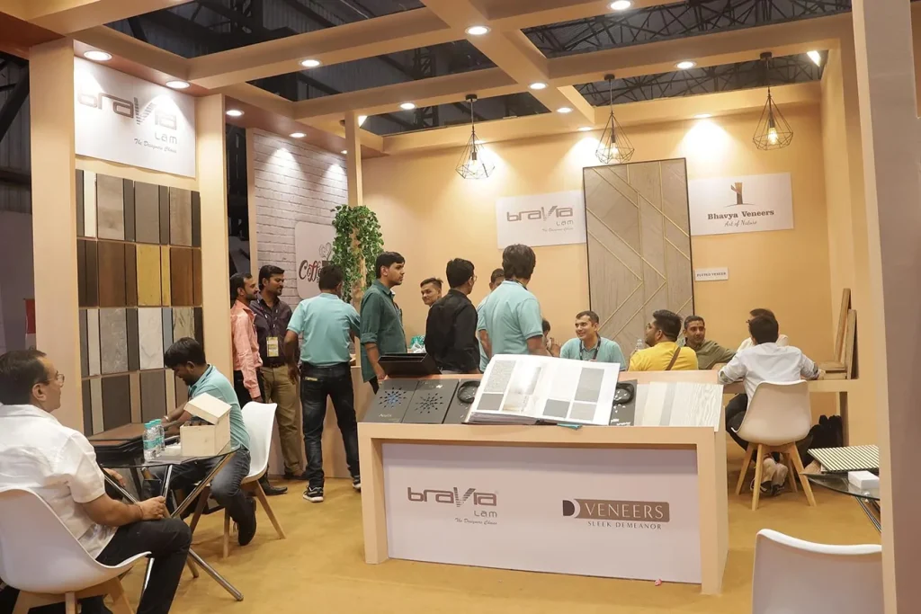
Trade show success depends heavily on booth design. A poorly designed booth can deter visitors, reduce engagement, and limit lead generation, no matter how strong your products or services are. By identifying common trade show booth design mistakes and implementing practical solutions, exhibitors can maximize foot traffic, enhance visitor experience, and achieve a strong return on investment. Understanding these pitfalls and how to correct them ensures a booth that is visually appealing, functional, and effective.
Mistake 1: Cluttered or Overcrowded Booths
A common mistake is cramming too many elements into a small space. Overcrowding can overwhelm visitors and make it difficult to navigate. To fix this:
- Prioritize essential displays and messaging
- Use modular displays to maximize vertical space without cluttering the floor
- Remove unnecessary furniture or props
- Maintain open pathways for easy visitor flow
Structured layouts like U-shaped or island booths help organize displays while keeping the space inviting and accessible.
Mistake 2: Poor Signage and Messaging
Visitors need to understand your brand and offerings within seconds. Vague or confusing signage can prevent engagement. Solutions include:
- Use clear, bold headlines that convey your value proposition
- Keep text concise and readable from a distance
- Highlight key products, services, or demos prominently
- Ensure consistent branding across all graphics and materials
Unstructured improvements such as layered visuals, props, or storytelling graphics can add depth while clarifying your message.
Mistake 3: Ignoring Visitor Flow
A booth that does not guide visitors effectively can create bottlenecks or missed engagement opportunities. To improve flow:
- Plan the layout around natural visitor movement
- Position interactive or demo stations strategically
- Allocate private or semi-private areas for discussions
- Use visual cues or signage to direct attendees through the space
Optimizing flow ensures that visitors experience the full story of your brand without congestion or confusion.
Mistake 4: Inadequate Lighting
Poor lighting makes booths appear dull and can obscure products or messaging. Fix lighting mistakes by:
- Using spotlights to highlight key products or signage
- Incorporating LED strips or backlighting for visual interest
- Adjusting lighting to accommodate venue conditions
- Using energy-efficient options to reduce costs and setup complexity
Even minor lighting upgrades can dramatically improve booth aesthetics and visitor attention.
Mistake 5: Lack of Interactivity
Booths that fail to engage visitors beyond visuals risk losing attention. Simple, non-interactive setups may not encourage meaningful conversations. To fix this:
- Incorporate touchscreens, tablets, or digital kiosks for product demos
- Use AR or VR experiences for immersive engagement
- Add gamification, contests, or interactive challenges
- Provide samples or hands-on demonstrations
Interactive elements invite participation and increase dwell time, which improves lead generation.
Mistake 6: Neglecting Branding Consistency
Inconsistent branding can confuse visitors and weaken recognition. To correct this:
- Align colors, fonts, logos, and messaging across all booth elements
- Ensure graphics and signage reinforce the same story
- Include consistent branding on furniture, flooring, and props
- Avoid mixing styles or themes that conflict with your brand identity
Unstructured touches like themed décor or creative displays can enhance storytelling while maintaining brand cohesion.
Mistake 7: Poor Use of Space
Underutilized or inefficiently used space limits engagement potential. Common issues include oversized empty areas or cramped product placement. Solutions include:
- Use vertical space for graphics or shelving to maximize the footprint
- Create defined zones for demos, product displays, and visitor interactions
- Incorporate flexible furniture that serves multiple purposes
- Design the layout to accommodate different visitor flow patterns
Structured use of space ensures visitors interact with your booth effectively while keeping it visually appealing.
Mistake 8: Ignoring Visitor Comfort
Visitor comfort is often overlooked, yet it is critical for engagement. Solutions include:
- Provide seating or lounge areas for longer interactions
- Maintain open areas to prevent feeling crowded
- Consider climate, lighting, and accessibility for all visitors
- Use welcoming elements such as plants, textures, or soft finishes
A comfortable booth encourages attendees to stay longer and engage more deeply.
Partnering with Experts
Even small adjustments can significantly improve booth performance, but many exhibitors benefit from professional guidance. Companies like ExpoMarketing offer design expertise, modular solutions, and layout planning to avoid common mistakes and maximize trade show success. Expert support ensures booths are visually appealing, functional, and strategically designed for engagement and lead generation.
Conclusion
Avoiding common trade show booth design mistakes is essential for attracting visitors, maximizing engagement, and generating leads. By addressing issues such as clutter, poor signage, ineffective flow, inadequate lighting, lack of interactivity, inconsistent branding, inefficient space use, and visitor discomfort, exhibitors can create booths that are professional, inviting, and impactful. Thoughtful design, combined with strategic upgrades and expert guidance, ensures a booth that stands out on the show floor, captures attention, and drives measurable results.

